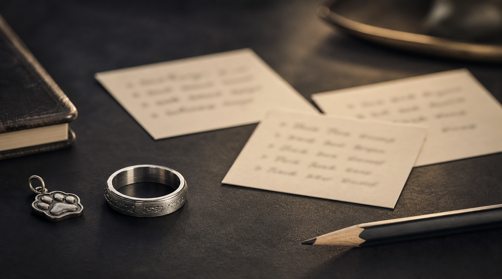


Treat the inside phrase, initials, date, or vow fragment that sounds like the couple as the ring's one job. Every other choice, from finish to placement, should make that detail easier to read, not harder.
A short list to choose from: "Always Us," "Home With You," initials plus date, proposal coordinates, one-word vows, private nicknames, or a short line from the ceremony. Narrow it to one lead detail before deciding on finish or placement.
inside placement is usually best for wording, while the outside can stay clean or carry one restrained symbol. Keeping that split clear is what keeps the ring from feeling crowded.
men's wedding bands need comfort and finish first, then engraving length and contrast. A finish that photographs well is not always the one that reads clearly on skin.
use fewer words than a card would use; a two-to-four-word line often feels more mature. Fewer words usually engrave more clearly than a full sentence.
write the exact phrase and a backup shorter version before choosing band width or font direction. A clean source file gives the designer more room to preserve the detail that matters.
pair the phrase with one anchor detail, such as date, initials, or coordinates. Resist the urge to fit in every meaningful detail; pick the one that matters most.
Common mistakes here: avoid jokes that will age badly, tiny outside text, and wording that feels unlike the wearer. Small curved metal shows clutter faster than a flat mockup ever will.
Decide whether the engraving should make him smile, steady him, or quietly point back to the vows. Everything else here exists to help answer that one question.
Once the details are gathered, bring the phrase, shorter backup, date, initials, and placement preference into the Friends of Irony designer.